 "cazzyodo" (cazzyodo)
03/09/2016 at 11:40 • Filed to: None
 0
0
 10
10
 "cazzyodo" (cazzyodo)
03/09/2016 at 11:40 • Filed to: None |  0 0
|  10 10 |
!!!error: Indecipherable SUB-paragraph formatting!!!
has some pretty in-depth statistics and history. I’ll admit it’s a study on death so morbid topic and all but I like numbers and historical information.

Hmmm...indeed.
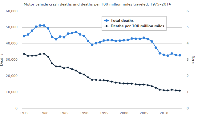
Interesting stuff overall. For example, fewer fatalities per million miles traveled. So overall safety seems to have improved over time, which is nice.
Some information leads to more questions. The below chart shows fatalities based on whether or not the individual was using a seat belt.
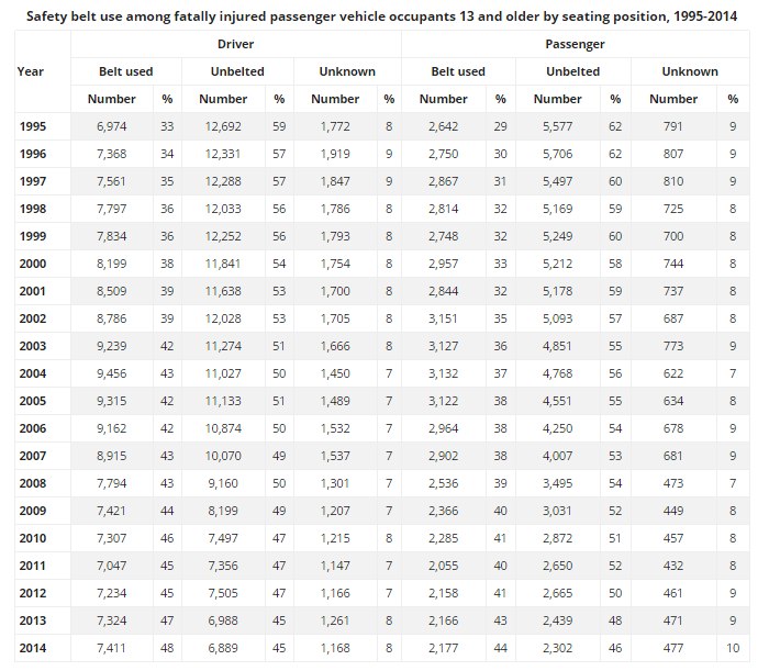
What does this tell us? Well, fatalities. But we can infer that that a growing number of people are wearing their seat belts overall. You could say that in 2014, it didn’t look like a seat belt was a helpful choice but we do not know the severity of and incidents (nor do they track/rate it like a Richter scale for automotive shit storms) with far more variables that could influence results. The best we can do is take the information for what it is: history.
Does speed kill? Maybe...maybe not.

It isn’t speed that kills but the rapid deceleration and associated impact.
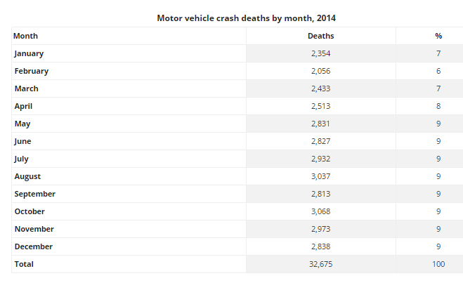
2014 seemed to be pretty consistent in regards to time of the year but another chart shows that the weekend is particularly dangerous. Careful out there Friday through Sunday!
There is even more information available and more conclusions can be drawn. What do you think, Oppo? Anything jump out at you?
 StoneCold
> cazzyodo
03/09/2016 at 11:44 |
|
I think an interesting statistic to look at would be alcohol-related fatalities, especially on that Friday-Sunday timeframe.
 StoneCold
> StoneCold
03/09/2016 at 11:51 |
|
...aaaaaand they have that information. Amazing how in ‘82, it was more likely a passenger vehicle fatality was because of alcohol than not.
 Patrick Nichols
> cazzyodo
03/09/2016 at 11:54 |
|
I like the speed and seat belt related data. I think it should be used to show progress towards safer driving rather than to be used as risk assessment. The percent of fatalities for the less safe option should always be reducing to show progress because the more avoidable deaths are being eliminated.
While Volvo is working to eliminate death altogether, the rest of us can do the simple things to ensure safer driving habits. Technology can only bring us so far.
 TheRealBicycleBuck
> cazzyodo
03/09/2016 at 11:57 |
|
Welcome to the fold. Perhaps we need to start Statsolopnik.
The point I made yesterday about their over-hyped article was the fallacy of looking at just the percentages. The total number of traffic fatalities was decreasing, while the total number of pedestrian fatalities was staying the same. When the two numbers were combined, this caused the percentage of pedestrian fatalities to increase over time, although there wasn’t really a change in the number of pedestrians hit by cars.
It’s nice to see you worked up the rates for total fatalities and seatbelt use and that they reflect changes in the total values. It would be nice to see how fatalities associated with speeding have changed as speed limits have increased over time. It begs several questions - are they positively or negatively correlated? If there are changes over time, is it due to changes in speed limits, highway design, or improvements in automobile safety?
So much data, so little time....
 cazzyodo
> StoneCold
03/09/2016 at 11:58 |
|
See, there’s way more info than I even bothered processing. I figured us as a collective had plenty of thoughts that could be resolved. Yours is a good one for sure.
Some of the stuff is really crazy.
 cazzyodo
> TheRealBicycleBuck
03/09/2016 at 12:00 |
|
Yup, I was doing the same thing yesterday. Charts! Numbers! STATISTICSSSSSSSSSSSSSSSSSSSSSSS
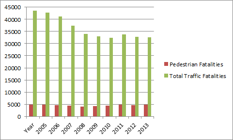
Posted that yesterday for perspective because people don’t always get how percentages work. I love numbers because they can’t lie.
 jariten1781
> cazzyodo
03/09/2016 at 12:03 |
|
When I’ve looked at these before I’ve always liked to convert to get a individual driver number, ie how long would an average driver need to be on the road to cause/die in a wreck. Take the rate given (1.08 deaths/100 M miles) and multiply by miles per year for the average driver (12,000 is a good estimate, DOT and NHTSA put together real ones by year but they're always near 12k). That gives you that the average driver in 2014 available equipment, in 2014 traffic, with 2014 required training causes .0001296 deaths per year. Or, in other words they would need to drive ~10,000 years to cause a death. Makes us all look a bit better than the 'all drivers are terrible' news stories we see...it's a scale issue; there's just a ton of us out there driving.
 TheRealBicycleBuck
> cazzyodo
03/09/2016 at 12:08 |
|
“I love numbers because they can’t lie.”
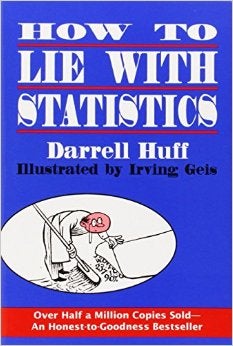
I hate to be the naysayer, but you’re wrong about that one. People use numbers to lie all the time. Case in point is yesterday’s headlines implying there has been a massive increase in pedestrian deaths. Without people like us coming along to set the record straight, the people who don’t like to mess around with the numbers get fooled.
The same holds true for maps, which is why this was required reading for all my students:

 cazzyodo
> TheRealBicycleBuck
03/09/2016 at 12:21 |
|
Numbers can’t lie but the people using them can.
Simple example is just graphs. That Y-axis can certainly tell a story if you set it that way. I had a boss that was big into that so that the story would look incredible or not as bad as the data suggested. Visuals!
I’ve had vendors do all sorts of things but when you get the data yourself you can verify whether it’s the truth, the whole truth, and nothing but the truth.
So, like you said, we see through the bullshit.
 cazzyodo
> jariten1781
03/09/2016 at 12:23 |
|
That’s a good way to look at things.
Also, I use that 12k number for estimates as well.